Showing posts with label Tim Holtz. Show all posts

Saturday, 30 July 2016

Art Journal: Hello Darkness My Old Friend

I’m pretty sure I’m going to divide opinion on this one – I wanted to challenge myself to create something in only greyscale this time.  The inspiration ended up being the music video for the cover of the Sound of Silence by Disturbed which has been beautifully directed.  I’ve used Pebeo acrylic paints in only mars black and titanium white, Tim Holtz tissue wrap and stamps by Sheena Douglass.  I’m curious to know what you think of this spread as I know it’s a lot moodier than what I normally do but art journaling is all about playing and trying things out!

Ingredients

  • Pebeo High Viscosity Acrylic Paints – Titanium White and Mars Black
  • Tim Holtz Tissue Wrap – Menagerie
  • A Little Bit Sketchy Silhouette stamps by Sheena Douglass
  • Black Archival Ink by Ranger
  • Spectrum Noir pen in true black
  • White Gesso by Pebeo
  • Gel medium by Golden

WP_20160729_001 [472425]

WP_20160729_003WP_20160729_004WP_20160729_006

Tim Holtz Eclectic Elements Fabric Patchwork Cushions

My mum got a new brown leather sofa and in conversation one day she asked me “what colour cushions do you think we should get?” to which I replied “well mother, I don’t recommend a colour but I can recommend some fabulous printed cottons which would be perfect for you!  So after spending an hour or so picking out the perfect fabrics I offered to make the cushions for her and I’m pleased to say that her and her husband were very pleased!  The fabrics were a delight to work with and I have a wedge of scraps to use on my own crafty projects hip hip hooray!!!  N.B. The cushions were 18” square.

Here are the finished cushions – for the backsides I started by creating an envelope fold using an old pair of trousers and a couple of shirt backs.  This was enough for two of the cushions but for the third one I had a crafty little trick up my sleeve to surprise them… it was a gamble…

WP_20160728_001WP_20160728_003WP_20160728_006

So two of them have backs like this…

WP_20160728_007


And the third was fashioned from one of the shirt fronts (and sleeves for the border).  They were very pleased with the secret stash pocket!

WP_20160728_002

And just for fun here’s how I went about sketching the ideas out and working out the measurements.

WP_20160728_013 [472423]WP_20160728_014 [472424]

Sunday, 10 July 2016

Tim Holtz–Summer of Creative Chemistry 2016

I’m taking part in Tim Holtz’s Summer of Creative Chemistry over at Online Card Classes and here’s a few reasons why I think you all should too! <3

SummerOfCreativeChemistry-Participant

  • The live forum’s with Tim Holtz have been reopened!
  • He seems to be answering every single question the people are asking
  • Recap Creative Chemistry 101 and 102 and surprise yourself!  When I first signed up to 101 and 102 I didn’t have that many supplies (mainly just distress inks) but I was thoroughly impressed with how much my stash has grown in the last year so I learnt even more techniques 2nd time round and recapped everything else to keep it fresh.
  • There are 4 sets of prizes given out each week (which are decent prizes!)
  • Start your own sets of technique tags which you can refer back to forever
  • Even if you don’t think you have everything right now, there will still be plenty of techniques for you or maybe it will encourage you to have a go with other things in your stash.
  • Be part of the brand new Creative Chemistry 103 when it is released in a couple of weeks with the same live access to Tim that you would have got when 101 and 102 launched.
  • Learn why we do stuff, why it works, why this and that go together and why those things over there resist each other, which surface to use, etc…
  • Apply the techniques to whatever craft you do: card making, stamping, scrap booking, art journaling, etc…

Here’s my set of technique tags which I’ve created from this week’s recap of CC102 – week 2: stencilling.

WP_20160709_011

Tuesday, 28 June 2016

Upcycled Wooden Box: Faux Leather

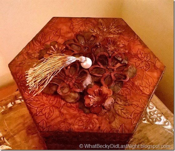
Created especially for the recent Sheena Douglass design team call out, I turned this wooden box into something that will never end up on a craft stall!  The paper technique is called Faux Leather by Sheena Douglass and involves turning kraft card into a soft chamois leather effect using a mix of water and glycerine. 

WP_20160628_006 (2)

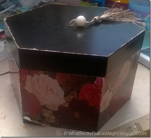
Here’s a photo of the sorry looking box before starting… this is NOT a second hand box, this is exactly how on found it on the graveyard self in my supermarket – heavily reduced, scratched, chipped and dodgy decoupage peeling off.  It’s a good size and made from wood, so as a crafter I had to save it!
WP_20160628_004

On the night before the renovation began I made up five sheets of A4 faux leather.  You can find a tutorial here: https://www.youtube.com/watch?v=EfunaRazSSo or on Sheena’s messy crafting DVD.  The next day I took some measurements and cut down some of the pieces to the right sizes for all of the panels on the box (with a little bit of overhang to get a nice finish later on).

For the background panels I used Sheena’s A4 embossing folder with the ivy leaves on it.  Using the remaining faux leather I die cut and embossed using Sheena’s fence, daisy border, briar rose and day of the dead dies.

Next came colouring up the pieces… normally I do a red-brown colouring (which I did do for the background) but I wanted to try making up green, blue, purple and yellow leathery pieces too.  To get that effect ink up using the base colour first, then go over with at least two different shades of brown.  I use distress inks. 

WP_20160628_002

Then at long last came the assembly stage.  I adhered the background with Colall tacky glue and sanded off the edges with a sanding block. Then I went around the sanded edges again with my darkest brown ink.  Then I stuck down the fence, daisy border and ivy leaves before I sealed everything with Pebeo’s Bindex medium.  This is the part that gives it durability and a shiny/satin finish.  You can use gel medium or spray varnish for paper. 

It was this point that I realised that the original tassel on the box was half decent so I poked a hole through my lid leather and reinserted it.  Then I added all of the diecut flowers but only after sealing with the bindex separately (so that I could paint it on flat before shaping later on the lid). 

And here is the finished result…
WP_20160628_015


WP_20160628_010

Friday, 27 May 2016

Art Journal: London

The techniques featured in this art journal spread was inspired by this month’s tag feature by Tim Holtz – namely the tissue tape resist.  The background was created using homemade spray ink with Aqua Tints.  I put texture medium through some stencils and then later caught it with gilding wax (I’m still waiting for shine-o-vision and sparkle-o-vision to be invented!).  The phrase written onto the postcard reads “Of all the places I have ever been – I have never known a place like London”.  Scroll down for a list of ingredients and close up photos…

Ingredients

  • Spectrum Noir Aqua Tints (I didn’t have any distress ink sprays waaaaaaaaahhhh)
  • Tim Holtz Distress Inks
  • Tim Holtz Tissue Tape
  • Stamps: Cityscapes and London by Stampers Anonymous / Tim Holtz
  • Post card stamp (unknown origin)
  • Ruler and Stars stencils by Tim Holtz
  • Tim Holtz Idea-ology: Heart Charms, Photobooth, Memo Pin, Mini Screw Brad
  • Archival Black Ink by Ranger
  • Antique Gold Gilding Wax by Pebeo
  • Pitt brush pen by Faber-Castell

WP_20160521_001

WP_20160521_002WP_20160521_003WP_20160521_004WP_20160521_005

Sunday, 1 May 2016

5 Background Techniques With… Aqua Pens / Spectrum Sparkle / Etc Volume 1

I’ve used a mixture of Spectrum Noir’s Aqua pens and Spectrum Sparkle pens but these techniques will work with your other water based pens including Distress Markers by Tim Holtz.  Also I have used a mixture of watercolour card and Sheena stamping card which both work well.

Techniques in this part include:

  1. Scribble onto mat, spritz and pat
  2. Scribble onto acrylic block, spritz and drag
  3. Air brush – with and without stencils
  4. Salt Technique
  5. Cling Film Technique

Scroll past the video for photos…

WP_20160430_21_45_04_Pro 1

1. Scribble your colours onto a non-porous surface (such as you craft mat, or a piece of acetate), spritz with water and then use your card to mop it up.  I dried the first layer of colour and went back for a second round.

WP_20160430_21_47_11_Pro 1

2. Scribble onto an acrylic block.  Spritz water onto the block and onto the card and then drag the colour through.

WP_20160430_21_45_56_Pro 1WP_20160430_21_46_37_Pro 1

3. Using an air brush spray your colours down (I just have the hand held one by Tim Holtz).  I then laid a stencil and air brushed a sparkle pen on top.  BONUS: The second image is then spritzing water onto the stencil and rubbing it off onto a another background.

WP_20160430_21_48_43_Pro 2

4. Colours were scribbled on randomly and plenty of water applied to get the colours moving.  I helped them along with a paintbrush to get them blending.  Then I chucked on some sea salt and left to dry naturally.  Once dry rub off the salt and you’re left with this beautiful organic look.

WP_20160430_21_49_46_Pro 2

5. Like the last background, scribble on your colours, get plenty wet and use a paintbrush the push the colours up to each other.  Crumple up a piece of cling film so there’s plenty of creases and squash it onto your card.  You should see darker lines forming in the seams.  Leave it to dry that way.

Saturday, 30 April 2016

Art Journal: Let’s Take Back Our Eggs!!!

Featuring Bird Crazy Stamps and Distress products by Tim Holtz, this is a fun page where I get to be silly again for a moment.  One of the birds is wearing the rabbit ears from the Crazy Things stamps and asking his buddies if they’ll come with him to get back “their” eggs.  These birds are so silly that they don’t realise that the Easter/Eostre Eggs are made from chocolate and they think that they’ll steal them back whilst pretending to be rabbits.

Apologies that you don’t get to see the very first step (I think the birds deleted it), but literally all I did was stick down some of the Tim Holtz tissue wrap, stick texture paste through the Blossom stencil with a spatula and cover the lot with gesso.  The rest of the background is made with Distress paints and inks.

WP_20160430_17_08_25_Pro 1

Ingredients

  • Stamps: Bird Crazy, Crazy Things and Feather Things by Tim Holtz
  • Stencil: Blossom by Tim Holtz
  • Distress Inks:  Lots of colours!
  • Distress paints: greens, blues and pink
  • Texture paste and white gesso by Pebeo
  • Tissue Wrap by Tim Holtz
  • Stamping card by Sheena Douglass
  • Archival Black ink
  • True Black Spectrum Noir pen
  • White gel pen and black fine liner
  • Liquid pearls in Daffodile
  • Googly eyes
  • Dark grey pitt brush pen by faber castell

WP_20160430_17_08_50_ProWP_20160430_17_08_39_ProWP_20160430_17_09_02_Pro

Tuesday, 26 April 2016

Mixed Media Canvas: Lucky

Here’s a lovely way of making art from whatever you may have lying around your crafting area.  Don’t let any colours distract you as the whole thing will be gesso’d out and recoloured.  I’ve taken a variety of stencils – including some by Tim Holtz, Sheena Douglass and Memory Box – and applied either texture paste or crackle paste using a spatula.  Once dried I’ve added all sorts of bits of pieces including some Idea-ology pieces (wooden letters, faux wishbone and a clay moulding of a clock face piece), paper flowers by Prima, lace ribbon, beaded string, card die cut pieces and a random tinker bell cabochon from a fancy dress outfit.  The whole piece got two coats of white gesso by Pebeo and was then left to dry.  Then came the Distress Crayons- yay!  These were scribbled on in vertical areas and painted out with a wet brush.  Once completely covered the piece wasn’t pulling itself together properly so out came the Dylusion ink spray.  This still allowed the colours from the distress crayons to show through but were now all related together from the top layer of turquois.  The final step was highlighting all of the raised areas (which are plentiful from all of the texture) with Empire Gold gilding wax by Pebeo.

WP_20160426_10_27_03_Pro 1

WP_20160426_10_27_20_ProWP_20160426_10_27_26_ProWP_20160426_10_27_35_ProWP_20160426_10_27_58_ProWP_20160426_10_28_09_Pro

Sunday, 10 April 2016

Bird Crazy Picture Book 1: Part 3–Making and Assembling the Book

Hurray I have finally sat down to complete our first picture book!  The video walks you through the entire process of how we can collate our pictures which we made previously and bind them into a cool little book.

You can revisit the previous tutorials here:

List of Materials

  • Chipboard
  • A4 Black Card
  • Stamping Card
  • Distress Inks: Walnut stain, bundled sage, mowed lawn, rusty hinge and wild honey
  • White Pen
  • Tim Holtz “Bird Crazy” Stamp set
  • Feather stamp from Stampers Anonymous
  • Tissue Paper
  • White and Black Gesso
  • Die Labels 28 by Spellbinders
  • Alpha stamps by Dovecraft
  • Archival Black Ink
  • Book Tape by Scotch
  • Crop-adile and Eyelets
  • Stringing Material
  • Acrylic PVA and a cheaper PVA
  • Matt Gel Medium

WP_20160409_22_37_18_Pro

WP_20160409_22_36_57_ProWP_20160409_22_39_56_ProWP_20160409_22_38_45_ProWP_20160409_22_38_56_ProWP_20160409_22_39_02_ProWP_20160409_22_39_15_Pro

Sunday, 13 March 2016

5 Background Techniques with Distress Inks Volume 1

Welcome to my new series which I have released over at YouTube focusing on a variety of background techniques for you to use.  This video starts you off with distress inks but keep an eye out for many other mediums.  As well as a video please scroll down for close up photos…

In this volume the techniques covered are:

  1. Foam Blending + Spritz with Water
  2. Faux Beaching + Splatters
  3. Stamping
  4. Gesso Resist Stamping
  5. Embossing Folder Press
WP_20160313_13_58_30_Pro

1. This is probably the first sort of background people play with when they get distress inks.  Using a foam applicator or piece of cut and dry foam lay down randomly your colours and overlap them.  Give it a spritz of water from a misting bottle and mop up excess with dry paper towel.

WP_20160313_13_58_16_Pro

2. Apply the colours as before (this time I’ve gone for more of a night sky look).  You can faux bleach with water and a brush for a moon shape and to create splatters you can flick water from your fingers.  Mop up the water with dry paper towel and this will lift your colour off.

WP_20160313_13_57_59_Pro

3. You can also stamp with distress inks.  For this background I have taken an assortment of my texture stamps from Crafter’s Companion and Sheena Douglass.  To finish I have distressed the edges to create a veneer. 

WP_20160313_13_57_36_Pro

4. Apply white gesso to your stamp (I’m using tissue to get a thin layer) and then stamp onto your card.  Make sure you clean your stamp well afterwards and make sure the card is completely dry.  Finish off with distress inks like in background 1.  For a subtle effect you can stop here or take a damp cloth or wet wipe and go over the gesso lightly.  You can lift a lot more ink off the gesso areas creating a contrast.

WP_20160313_13_57_04_Pro

5. Apply the ink pad directly to either side of your embossing folder depending on which way round you want it.  It will always be the debossed areas which will be inked.  Run it through your embossing machine as normal.  You will only get ink where the folder pressed into the card.